

The Painterly Print
Rachel Siporin, a painter for many years, in 2011 began to explore the unusually demanding process of making color reduction relief woodcut prints. In relief printing the area of the flat woodblock that is cut away does not print; only that which remains in relief prints. But more complicated in color reduction relief printing is the fact that, working on a single woodblock, the artist prints a sequence of colors, one color at a time, working from lighter tones to darker tones -- all the while cutting more away from the woodblock each time a color is added to the print. This unforgiving process demands that the artist have a secure sense of what she wants in the end, the composition already drawn on the block at the beginning, and color relationships envisioned. All one's painting skills are brought to bear. But why work using this complicated process to make a print?
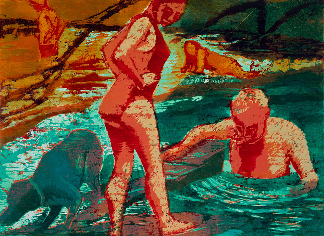
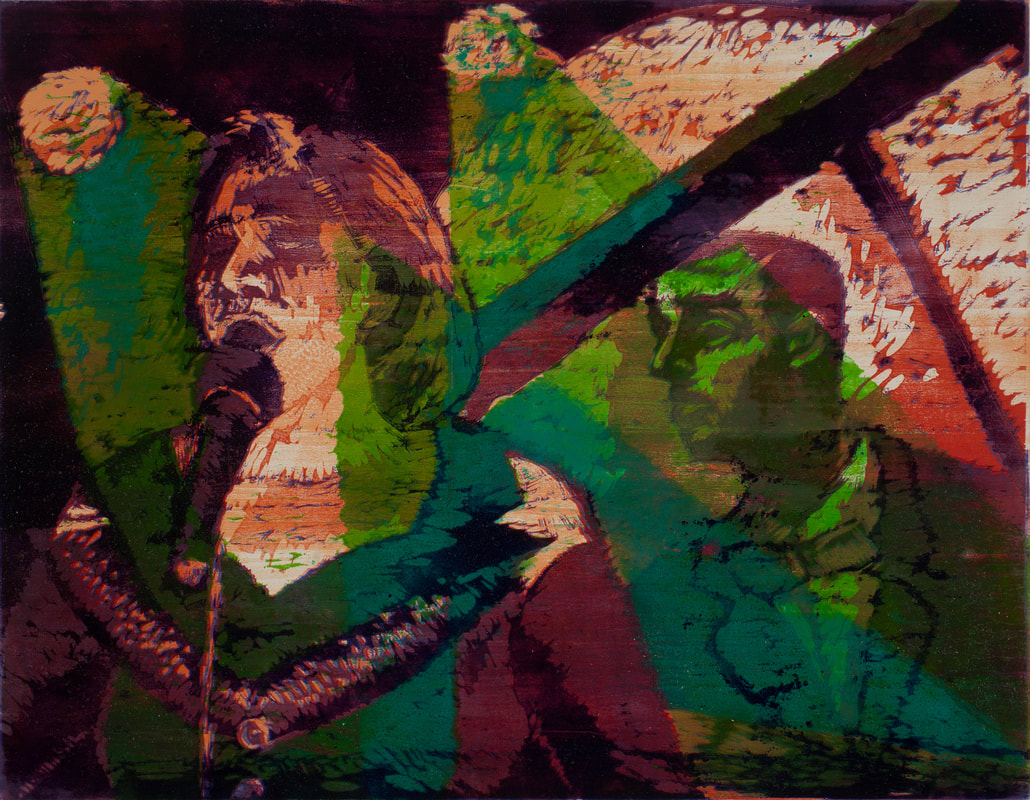
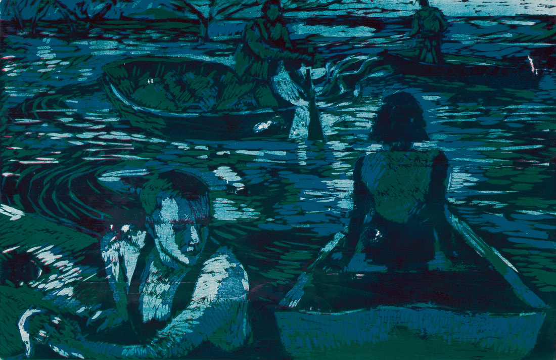
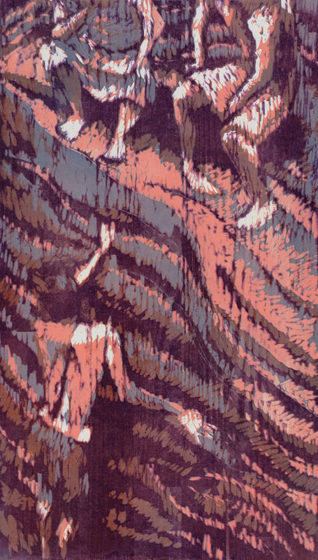
The virtue of this process for Siporin is that it gives effects that she doesn't get in the medium of drawing or painting. The resulting works read as prints, one notices especially the response of her mark-making to the wood graining, but the colors have the liveliness of painting. Here we can begin to speak of painterly prints. Siporin's colors are the result of working with the layers required in the color reduction relief process. Colors overlap, generating a range of often unexpected edges, transforming traditional drawing in the process (take for example, the rough hewn areas on the backs of the swimmers in Invitation), generating unexpected spatial effects (for example, the last application of the dark toned purple in Invitation establishes the foreground spatial position of the two swimmers). But perhaps most exciting for Siporin: such overlapping creates an extraordinary variety and subtlety of hue.
As a painter, she is drawn to the application of color. Even as she submits in the woodcuts to a relatively reduced color vocabulary, as each time she prints with just one color, she gains complexity, first by experimenting with transparent colors. The transparent medium added to the colored inks allows some underlying colors to still come through. Sometimes Siporin resorts to using two blocks. For example in Collie, and I saw this print still in process, Siporin had just used a second block to apply turquoise over an earlier orange, which happened to cause in the area of the dog and the rocks in the lower left a subtle and unexpected greying of the blue. Such color surprises, inherent in the technique, delight her.
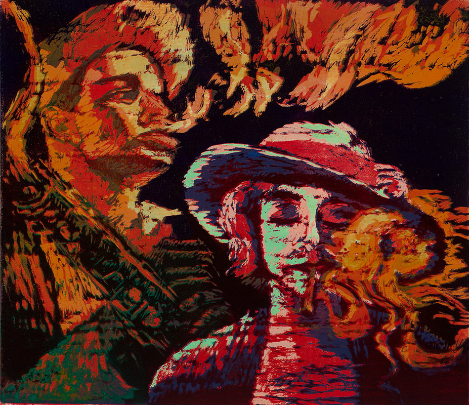
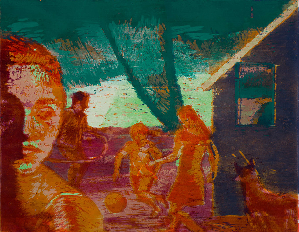
Even as overlapping colors complicate Siporin's prints, the color reduction relief process forces her to attend to simplified abstract shapes underlying her compositions, as she works her way down through the block. This degree of abstraction in turn further clarifies, she says, what has long been an aspect of her work as a painter: narrative. In treating her themes, ranging from natural disasters to nightlife, photographs often drawn from newspapers of dramatic moments with their unexpected croppings, condensed space and intense tonal contrasts have long fed her invented narratives. Now the further abstract simplification of her compositions leads to the intensification of relations between figures (as in the
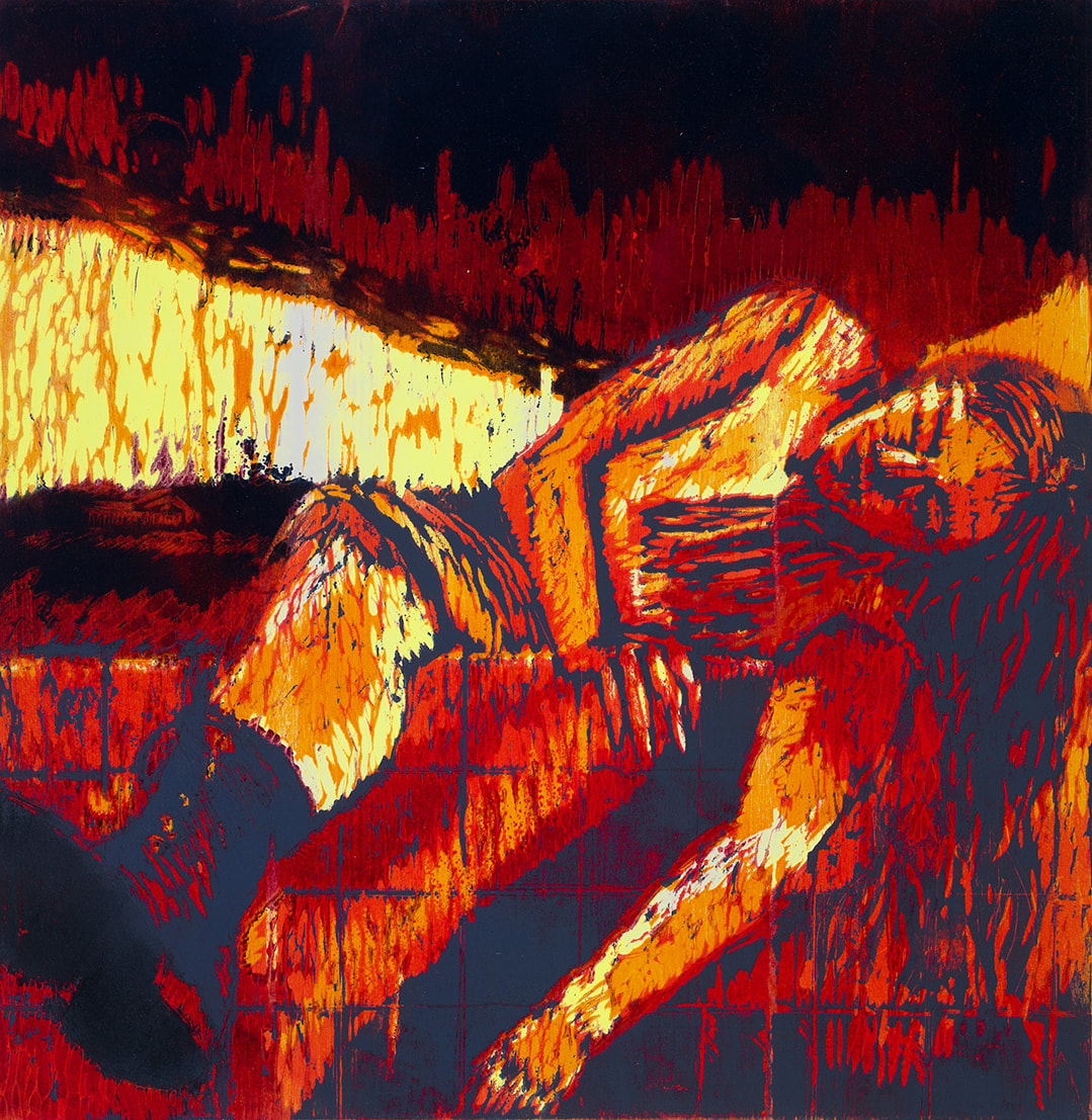
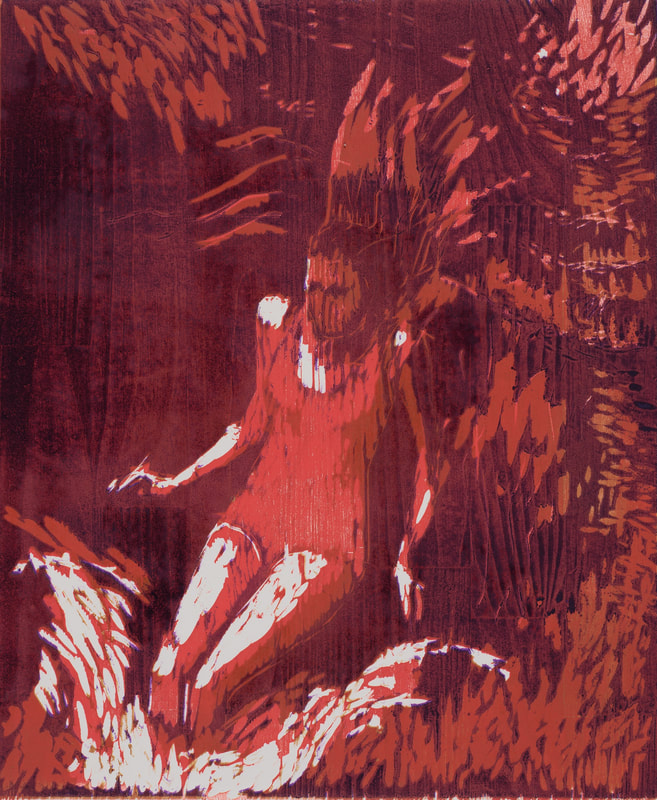
moody and dream-like scape in Journey Home, created at the time of her mother's death) and between figures and their situations. Do the two swimmers to either side of the foreground in Invitation accept or reject the invitation of the central orange-yellow woman into a sunlit turquoise watery world? Simplification of composition and a growing complication of color and light signal the continuing growth of an intriguing art.
Elizabeth L. Langhorne
Professor of Art History, Art Department
Central Connecticut State University
The virtue of this process for Siporin is that it gives effects that she doesn't get in the medium of drawing or painting. The resulting works read as prints, one notices especially the response of her mark-making to the wood graining, but the colors have the liveliness of painting. Here we can begin to speak of painterly prints. Siporin's colors are the result of working with the layers required in the color reduction relief process. Colors overlap, generating a range of often unexpected edges, transforming traditional drawing in the process (take for example, the rough hewn areas on the backs of the swimmers in Invitation), generating unexpected spatial effects (for example, the last application of the dark toned purple in Invitation establishes the foreground spatial position of the two swimmers). But perhaps most exciting for Siporin: such overlapping creates an extraordinary variety and subtlety of hue.
As a painter, she is drawn to the application of color. Even as she submits in the woodcuts to a relatively reduced color vocabulary, as each time she prints with just one color, she gains complexity, first by experimenting with transparent colors. The transparent medium added to the colored inks allows some underlying colors to still come through. Sometimes Siporin resorts to using two blocks. For example in Collie, and I saw this print still in process, Siporin had just used a second block to apply turquoise over an earlier orange, which happened to cause in the area of the dog and the rocks in the lower left a subtle and unexpected greying of the blue. Such color surprises, inherent in the technique, delight her.
Even as overlapping colors complicate Siporin's prints, the color reduction relief process forces her to attend to simplified abstract shapes underlying her compositions, as she works her way down through the block. This degree of abstraction in turn further clarifies, she says, what has long been an aspect of her work as a painter: narrative. In treating her themes, ranging from natural disasters to nightlife, photographs often drawn from newspapers of dramatic moments with their unexpected croppings, condensed space and intense tonal contrasts have long fed her invented narratives. Now the further abstract simplification of her compositions leads to the intensification of relations between figures (as in the
moody and dream-like scape in Journey Home, created at the time of her mother's death) and between figures and their situations. Do the two swimmers to either side of the foreground in Invitation accept or reject the invitation of the central orange-yellow woman into a sunlit turquoise watery world? Simplification of composition and a growing complication of color and light signal the continuing growth of an intriguing art.
Elizabeth L. Langhorne
Professor of Art History, Art Department
Central Connecticut State University
©2022 Rachel Siporin